Tuesday, April 5, 2011

Monday, April 4, 2011
Aboriginal Motifs
Functions & Philosophies:
Indigenous Control
In using Indigenous Australian art and motif, respect must be payed to the artist and to the use of the work. It is up to the creator how and what I am able to use. This is as they have creative control and the right to govern themselves. If I wish to use the art or motifes of a spesific regeion, I must ask permission of the leader of that area. In doing so, it is good to go through the government, as there is an infrastucture of control and contact set up which can direct me in the direction of the right person to talk to.
Communication, Consultation and Consent
In using work, communication with artists must be established. Often it is up to multiple people to decide weather a body or piece of work can be used. As the communities of Indigenous Australians operate in different protocols, I must be prepared for a long process as the decision is made. Often a meeting must be held to decide weather the context in which the work will be used is appropriate.
It is also good will to respect the wishes of Aboriginals not to represent the dead, and have respect for the divisions of culture which exist in different communities. Every community is different, which means that every call to use work will be different to the next.
Moral Rights & Issues
If referencing Aboriginal Motifs in design, I can reference such motifs if I make original work. However from a standpoint of respect It would be good to discuss and ask an Aboriginal representative to keep a good relationship for future dealings.
References:
http://www.australiacouncil.gov.au/__data/assets/pdf_file/0004/32368/Visual_arts_protocol_guide.pdf
If referencing Aboriginal Motifs in design, I can reference such motifs if I make original work. However from a standpoint of respect It would be good to discuss and ask an Aboriginal representative to keep a good relationship for future dealings.
References:
http://www.australiacouncil.gov.au/__data/assets/pdf_file/0004/32368/Visual_arts_protocol_guide.pdf
Monday, March 28, 2011
Native American Motifs
 |
| Source |

Name: Frölunda HC
Logo: A native American man in a traditional war bonnet. Consists of 4 colours. Colours used are traditional earth colours, popular in native culture. Shape is a key elements in creating look of eyes, face and feathers. In creating the war bonnet, repetition of the feather produces a nice aesthetic. Overall a very symmetrical balanced design.
Theory: The Frolunda hockey club logo depicts an native American man in a head dress, also known as a war bonnet. This is a motif. It represents strength, loyalty and honour. In native culture these were very symbolic, as each feather has to be earned through a dangerous act in war. Being very hard to earn, a man with many feathers would be highly respected.
Feelings: I feel this is a nice logo, and not completely tasteless as the motif of the war bonnet is used in a realistic context. That said if native Americans feel it is a misrepresentation of culture or that it is rude, then on the good will of the frolunda hockey club is should be changed.
Sources: http://en.wikipedia.org/wiki/War_bonnet
http://en.wikipedia.org/wiki/Frölunda_HC
Tuesday, March 22, 2011
Logo Critique
1968 Olympics
 When asked to a design an olympic logo, the brief given states that you need the olympic rings and the citys name and year stated. The rest is on the designer. As such a lot of the created designs are rather simple with little deviation or extreme creativity. A lot of the asthetic of the design falls back on the architecture and venues created for the olympics.
 When Mexico was asked to host the olympics, as a developing city, they could not afford such amazing architecture as other world class cities could. So the importance in design fell back on the logo.
Lance Wyman was the graphic designer responsible for the logo, which was used on applications from stamps to famtasticly big posters.
The logo makes great use in coupling line and letterform to create a visual repetition to represent what the olympics ment to mexico at the time, as it was in an important period of growth and expansion.
The logo takes its fantastic paralell line type design from historical Mexican art to create a very dynamic and rythmic logo. The logo itself is fantastic in this sence, as it created a very powerful identity, which flowed on in all other aspects of the olympics.
The curved, continuous stroke creates uniformity, and also allows a sence growth to be seen as the frequency of lines increases; also relevent to growth of Mexico at the period.
Personally I do like this logo, it is very eye catching and for such a simple concept really does have alot of ideaology behind it.
http://olympic-museum.de/design/lancewyman/wyman.htm
http://olympic-museum.de/poster/poster1968.htm
purple monkey dishwasher
Melbourne Cricket Club

The melbourne cricket club logo is an emblum consisting of the three letters that make up the abreviation MCC. The emblem makes use of line and scale to balance the three letters as they intertwine with each other, creating a sence of movement in the design.
The elements prodominant in the design, letterform and colour, pretty much make the design what it is. By using stylised letterform a sence of history and importance is created. Coupled with the principal of balance a sence of unity is created, as all three letters have equal viewability.
In my opinion, this is a very good logo, and quite representitive of what the Melbourne Cricket Club represents. By this I mean that cricket is a game of friendly competition; allthough playing for sucess it is all about respect and equality.
Please note that no information on who designed the logo, or when could be found. It is presumed that it came into existence when the club was created in 1838.
http://mcc.com.au
Elements, Principals
Elements of Design
Line
Created when a point moves continuously on surface. Can be considered the building blocks for many other elements such as shape and letter form.
colour
The way lights reflects off a surface. There can by many types of colour such as Primary, secondary.
texture
Either physical or can be seen, such as the feel of a 3d object, or the appearance of a 2d one.
shape
Such as squares or circles, created by joining or curving lines to create a closed area.
form.
either physical or visual. If visual it is the appearance of 3 dimensions, physical is having 3 dimensions.
Principals of Design
Stability
When a design appears stable; balanced; harmonious.
dynamics
A design which appears to have movement and leafs your eyes around the design. Can drastically change the feel of a design.
rhythm
Repetition or alteration of elements in a design created rhythm. Rhythm is often used to create patterns and shape.
scale
An effect created when having elements bigger than others; a sence of size is created. Can be used to create importance in a design.
Art Vocal List
Stroke
An effect were by an object has a line around its bounds. Can be dotted, continuous, thick or thin.
Symmetry
Created when a design is equal in terms of elements on both sides.
Hierarchy
An order to design. Important to consider when you need your viewer to see a design in a certain way.
Proportion
How big/ small an element looks in proportion to another.
Pattern
Created when repeating elements multiple times.
Adjective List
Calligraphic
A style of line used to create by variation in thick and thin line, often used in text
Monochromatic
When a design used only shades of black
Organic
A very natural - curved and plant like design
Geometric
Very square, angled and mathematic
Smooth
A texture void of many bumps.
Tuesday, March 8, 2011
Style Time Line
Anti-realism
 |
| Source |

Max Ernest was a famous artist in the trend, creating very wonderful works dealing with many surreal themes.
Andre Masson was another famous French artist who thrived in the era.
Sources:
Les Automatistes
 |
| Source |
Sources:
http://en.wikipedia.org/wiki/Les_Automatistes
http://en.wikipedia.org/wiki/Surrealist_automatism
Colour Field
 |
| source |
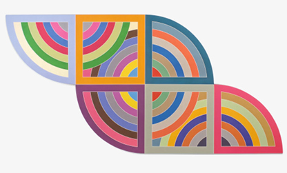
Kennith Noland was a very famous artist, who is credited as taking colour field very much to the main stream.
Many artists created art in the field in the 20 year boom that it was prominent in. A famous artist, Frank Stella's work, is visible to the left. He explored a lot of line and shape in his work, in a very abstract sense.
Sources:
http://en.wikipedia.org/wiki/Color_Field
Hyperrealism Impressionism
 |
| Source |
Robert Neffson is another famous artist in this field, who is more focused on taking the reality of a landscape and extrapolating it to try and create a more emotional response from the viewer.
Sources:
http://en.wikipedia.org/wiki/Hyperrealism_(painting)
http://www.mymodernmet.com/profiles/blogs/21-mindblowing-hyperreal
International Typographic Style
 |
| Source |
Many designers thrived working to this style. Paul Rand is a notable designer for his corporate identities for US companies such as IBM, ABC and Enron.
Sources:
http://www.britannica.com/EBchecked/topic/1032864/graphic-design/242772/Graphic-design-1945-75?anchor=ref845121
http://www.smashingmagazine.com/2009/07/17/lessons-from-swiss-style-graphic-design/
http://en.wikipedia.org/wiki/International_Typographic_Style
Magic Realism
 |
| source |

It was formed out of a style of art called New Objectivity, which was in a way changing the what the realistic world was to something of the imagination.
 |
| Source |
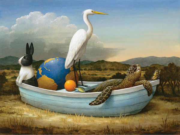
A modern day Magic Realist artist, Kevin Sloan's work can be seen to the right. His work is very much inspired by his traveling.
Sources:
http://www.huntfor.com/arthistory/C20th/newobjectivity.htm
http://en.wikipedia.org/wiki/Magic_realism
Orphism
 |
| Source |

The movement was started by famous artist Robert Delaunay and his wife. Their art was very absrtact yet also represented recognisable shapes, just in no real context.
Sonia Delaunay, Roberts wife also created very fabulous art, more so gemoetric it was however
Sources:
Qajar art
 |
| Source |
Kamalolmolk was a famous painter in the later times of the empire. Known for his realistic paintings by him and his peers, such as Semnan. His work is on display in galleries around the world today.
Sources:
Realism
 |
| Source |

With that said it was at times very controversial, being such an open genre. Gustave Courbet, famous for creating art around the beginnings of the movement, was one such artist who painted scenes of areas that the upper class chose to turn a blind eye to. The fact that this form of art would be so controversial may have been its attraction for many people.
Oswold Achenbach was another famous artist at the time, who captured some very fantastic sunsets and environments.
Sources:
http://en.wikipedia.org/wiki/Realism_(arts)
http://en.wikipedia.org/wiki/Oswald_Achenbach
http://en.wikipedia.org/wiki/Gustave_Courbet
Space Art
 |
| A Don Davis image. Source |

Space art is predominantly painting and illustration, however it can also include sculpture.
It has existed for over 100 years, with many artists painting space settings in the 1800's.
Chelsey Bonestell is one such artist, who was born in 1888. He is known as the father of modern space art as he very much started the movement.
Don Davis is another famous artist, who has created a lot of famous space art, much of which was for big clients such as NASA.
Sources:
http://en.wikipedia.org/wiki/Don_Davis_(artist)
http://en.wikipedia.org/wiki/Chesley_Bonestell
http://en.wikipedia.org/wiki/Space_art
http://www.google.com.au/images?client=safari&rls=en&q=space+art&oe=UTF-8&redir_esc=&um=1&ie=UTF-8&source=og&sa=N&hl=en&tab=wi&biw=1277&bih=755
Subscribe to:
Posts (Atom)