Monday, May 30, 2011

Copyright Issues

For creation of a logo, and its applications, images and fonts would have to be sourced or created. If they are sourced, then someone has taken the time and effort to create them. As such they will most likely have a detailed set of terms and conditions surrounding them and their use.

Images:
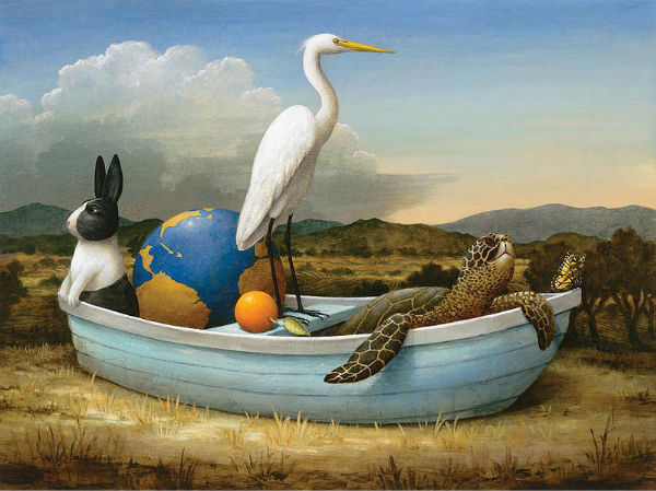
The images below have been sourced from Shutterstock.com, and would be used as applications for the logo I will create.

To purchase these images Shutterstock.com has given me a number of different liscencing options. If i wish to use the image for a limited audience, I can buy a five image plan for $45 AU dollars. This allows me access to 5 images off the website in high resolution.

In using these images I am agreeing to the contract of use put in place by shutterstock.com. Some key terms that i have to ad-hear to are:

  1. I can apply the images (on a limited licence, which I am on) to a medium which can be viewed by up to 250,000 people. No more. 
  2. In displaying the images on the web, the images must be no bigger than 800x600 pixels.
  3. The images can not be used in a bad/ offensive light, such as: A strip club, or by a politician.
Font:
The font that may be used in my logo creation have been sourced from fontfont.com.

 In purchasing this font, I am given a number of options for buying. For $26 I can buy a single weight of the font from the set. It will be liscenced to be used by up to 5 people. For $115 I can but the entire set of three fonts, also to be used by up to five people.

Some terms and conditions that I must ad-hear to in using the fonts are:

  1. I can give the font to five other people in my geographic location (eg, studio) to use.
  2. If the font does not perform as expected, I can get a refund.
  3. I can not transfer my liscence to the font.

Monday, May 9, 2011

Current trends in Graphic Design

Current Design Trends.


Humour
Or taking yourself and concepts very seriously were running trends through a number of designers. This proved to be a big tool in self promotion as the people following this were very easy to talk to and charismatic. 


Chris Doyle's 
work had many undertones of humor, which was a productive makerting tool for him when he released his personal style guide. In this piece he was at the centre of a style guide on how he lived his life. It went viral on the internet, giving a lot of positive attention to him as a creative. His work in the AGDA calendar also used humor as a vessel to give the calendar integrity. As it was sent to many designers, who are quick to judge work, especially when it is a design for a design foundation sent to designers. 


Claudio Kirac's
work very much took a humours  approach to every day subjects in the art works completed. Slipping in little faces and out of place objects he injects a world of personal social commentary and personal style that have allowed him to complete such a fulfilling and complete career of his dreams.     


Typography
Is very much a trending element in many contemporary designs, with focus on custom font faces and advanced use of kerning to give a tailored look to an often bland and overlooked area of design.


Fanette Mellier's 
work uses typography many times to encapsulate her fantastic use of colour and to give emphasis to the work in the context of its landscape, such as her piece for "Les Coloures" or Colour Festival, which was hand crafted typography placed in an urban environment. The uniquely crafted style very much stood out. Her work in "les charmettes" or The Charmettes Festival also had a similar appeal, with very special custom printed, and very detailed typography. It was placed at the back of a dinner party as well as shown all throughout the festival to give flow as you moved around. 


Something Splendid's 
work also encapsulates a conceptual theme into a custom typography, giving a very meaningful look to the types applied to designs. Example the font made for the Melbourne Fringe Festival. The type is made to look like a birds eve view of a city scape. This is relevant as the festival is held all around the urban ares and city of melbourne. They have also done typographic work as a promotional tool with the website http://cocktailtyper.com/ , which allows you to type a message on a board layered with cocktail umbrellas. This creative piece has won them much attention. 


Resources:
http://cargocollective.com/christopherdoyle
http://www.claudiokirac.com
http://staybearded.blogspot.com/2008/06/fanette-mellier.html
http://www.somethingsplendid.com.au/


Work Critique
"The Racist Brain" 
by Adam Hunt


This is a very clean and clear piece.  Developed for the European youth campaign against racism, it is an anti racism piece. 


Using a limited colour palette and elements of design, a clear hierarchy has been established. Eyes are lead first to the brains, due to the colour. Second to the type below due to the contrast on the background. At this point the concept comes clear.


The concept of racists having a smaller brain is visually clear and concise, and encapsulates the message of the campaign and organisation clearly. 


This was a successful campaign as it bought a lot of attention to the campaign, in the form of a debate. Many people felt offended by the campaign, which was then bought into the media and given international attention. Shown in this is that the concept of the poster was very clearly understood.
A+

Monday, April 4, 2011

Aboriginal Motifs

Functions & Philosophies: 
Indigenous Control
In using Indigenous Australian art and motif, respect must be payed to the artist and to the use of the work. It is up to the creator how and what I am able to use. This is as they have creative control and the right to govern themselves. If I wish to use the art or motifes of a spesific regeion, I must ask permission of the leader of that area. In doing so, it is good to go through the government, as there is an infrastucture of control and contact set up which can direct me in the direction of the right person to talk to. 

Communication, Consultation and Consent
In using work, communication with artists must be established. Often it is up to multiple people to decide weather a body or piece of work can be used. As the communities of Indigenous Australians operate in different protocols, I must be prepared for a long process as the decision is made. Often a meeting must be held to decide weather the context in which the work will be used is appropriate. 

It is also good will to respect the wishes of Aboriginals not to represent the dead, and have respect for the divisions of culture which exist in different communities. Every community is different, which means that every call to use work will be different to the next.  

Moral Rights & Issues
If referencing Aboriginal Motifs in design, I can reference such motifs if I make original work. However from a standpoint of respect It would be good to discuss and ask an Aboriginal representative to keep a good relationship for future dealings.


References:
http://www.australiacouncil.gov.au/__data/assets/pdf_file/0004/32368/Visual_arts_protocol_guide.pdf

Monday, March 28, 2011

Native American Motifs

Source

Name: Frölunda HC

Logo: A native American man in a traditional war bonnet. Consists of 4 colours. Colours used are traditional earth colours, popular in native culture. Shape is a key elements in creating look of eyes, face and feathers. In creating the war bonnet, repetition of the feather produces a nice aesthetic. Overall a very symmetrical balanced design. 

Theory: The Frolunda hockey club logo depicts an native American man in a head dress, also known as a war bonnet. This is a motif. It represents strength, loyalty and honour. In native culture these were very symbolic, as each feather has to be earned through a dangerous act in war. Being very hard to earn, a man with many feathers would be highly respected. 

Feelings: I feel this is a nice logo, and not completely tasteless as the motif of the war bonnet is used in a realistic context. That said if native Americans feel it is a misrepresentation of culture or that it is rude, then on the good will of the frolunda hockey club is should be changed. 

Sources: http://en.wikipedia.org/wiki/War_bonnet
http://en.wikipedia.org/wiki/Frölunda_HC

Tuesday, March 22, 2011

Logo Critique

1968 Olympics
When asked to a design an olympic logo, the brief given states that you need the olympic rings and the citys name and year stated. The rest is on the designer. As such a lot of the created designs are rather simple with little deviation or extreme creativity. A lot of the asthetic of the design falls back on the architecture and venues created for the olympics. 

When Mexico was asked to host the olympics, as a developing city, they could not afford such amazing architecture as other world class cities could. So the importance in design fell back on the logo. 

Lance Wyman was the graphic designer responsible for the logo,  which was used on applications from stamps to famtasticly big posters. 

The logo makes great use in coupling line and letterform to create a visual repetition to represent what the olympics ment to mexico at the time, as it was in an important period of growth and expansion.  

The logo takes its fantastic paralell line type design from historical Mexican art to create a very dynamic and rythmic logo. The logo itself is fantastic in this sence, as it created a very powerful identity, which flowed on in all other aspects of the olympics.  

The curved, continuous stroke creates uniformity, and also allows a sence growth to be seen as the frequency of lines increases;  also relevent to growth of Mexico at the period. 

Personally I do like this logo, it is very eye catching and for such a simple concept really does have alot of ideaology behind it.  

http://olympic-museum.de/design/lancewyman/wyman.htm
http://olympic-museum.de/poster/poster1968.htm
purple monkey dishwasher

Melbourne Cricket Club
The melbourne cricket club logo is an emblum consisting of the three letters that make up the abreviation MCC. The emblem makes use of line and scale to balance the three letters as they intertwine with each other, creating a sence of movement in the design. 

The elements prodominant in the design, letterform and colour, pretty much make the design what it is. By using stylised letterform a sence of history and importance is created. Coupled with the principal of balance a sence of unity is created, as all three letters have equal viewability. 

In my opinion, this is a very good logo, and quite representitive of what the Melbourne Cricket Club represents. By this I mean that cricket is a game of friendly competition; allthough playing for sucess it is all about respect and equality. 

Please note that no information on who designed the logo, or when could be found. It is presumed that it came into existence when the club was created in 1838. 
http://mcc.com.au

Elements, Principals

Elements of Design
Line

Created when a point moves continuously on surface. Can be considered the building blocks for many other elements such as shape and letter form.


colour 

The way lights reflects off a surface. There can by many types of colour such as Primary, secondary.


texture

Either physical or can be seen, such as the feel of a 3d object, or the appearance of a 2d one. 


shape
Such as squares or circles, created by joining or curving lines to create a closed area.


form.

either physical or visual. If visual it is the appearance of 3 dimensions, physical is having 3 dimensions.


Principals of Design
Stability

When a design appears stable; balanced; harmonious.


dynamics

A design which appears to have movement and leafs your eyes around the design. Can drastically change the feel of a design.


rhythm
Repetition or alteration of elements in a design created rhythm. Rhythm is often used to create patterns and shape.  


scale
An effect created when having elements bigger than others; a sence of size is created. Can be used to create importance in a design.

Art Vocal List
Stroke
An effect were by an object has a line around its bounds. Can be dotted, continuous, thick or thin.

Symmetry
Created when a design is equal in terms of elements on both sides.

Hierarchy
An order to design. Important to consider when you need your viewer to see a design in a certain way.

Proportion
How big/ small an element looks in proportion to another.

Pattern
Created when repeating elements multiple times.

Adjective List
Calligraphic
A style of line used to create by variation in thick and thin line, often used in text

Monochromatic
When a design used only shades of black

Organic
A very natural - curved and plant like design

Geometric
Very square, angled and mathematic

Smooth
A texture void of many bumps.

Tuesday, March 8, 2011

Style Time Line

Anti-realism
Source
Anti-Realist art, in a literal sence, is the opposite of realist art. The basis of this art is that the artist denies the true nature of what he is depicting, and presents it differently. It has been around for many many years, however it is said to have started in the 1920's with surrealism. This form of art was very much realistic looking, focusing on surreal subject matter. 


Max Ernest was a famous artist in the trend, creating very wonderful works dealing with many surreal themes.


Andre Masson was another famous French artist who thrived in the era.

Sources:

Les Automatistes
Source
Les Automatistes are a group of artists from Quebec, who were inspired by Automatism. Automatism is a style of automatic art; or art were you let your hand draw with no aim or goal. It is credited as existing since 1942, when an artist famous in the field, Paul-Émile Borduas, had an art show. Roger Fauteux was also a member of the group. The group of artists split up soon after 1948.
Sources:


http://en.wikipedia.org/wiki/Les_Automatistes
http://en.wikipedia.org/wiki/Surrealist_automatism


Colour Field
source
Colour field is a style of art that emerged from new york during the 1940's. It was characterised by the use of big circles of colour, ofter overlapping each other. It is said to have evolved from a form of impressionism art, which focused on the intense emotional impact that art can have. More or less colour field work is about the subjective emotion that people feel from the work. 


Kennith Noland was a very famous artist, who is credited as taking colour field very much to the main stream.


Many artists created art in the field in the 20 year boom that it was prominent in. A famous artist, Frank Stella's work, is visible to the left. He explored a lot of line and shape in his work, in a very abstract sense. 


Sources:

http://en.wikipedia.org/wiki/Color_Field


Hyperrealism Impressionism
Source
This form of art is characterised by the emphasis on making the paintings or sculptures as photorealistic as possible. Accurate light, texture and colour all help to make this possible. It is more or less the same as impressionism, if not more detailed. It has been growing as a movement since the early 2000's. Many famous artists exist in the field, with one of the more recognisable being Ron Mueck. He has focused on creating accurate sculptural representations of people, which play with scale. This has a profound effect on the viewer, as you can feel amplified emotion.  


Robert Neffson is another famous artist in this field, who is more focused on taking the reality of a landscape and extrapolating it to try and create a more emotional response from the viewer. 


Sources:
http://en.wikipedia.org/wiki/Hyperrealism_(painting)
http://www.mymodernmet.com/profiles/blogs/21-mindblowing-hyperreal

International Typographic Style
Source
International Typographic style emerged from sweden around the 20's, after world war II. It was started by Armin Hoffman and Emil Ruder. The aim of this movement was to remove a personal bias or emotion from design, and have a more unified, clean, objective style. With this in mind, ITS designs used mathematical grids, sans serif fonts, and black and white photos (in place of illustrations) to form a very clean basic guideline.  


Many designers thrived working to this style. Paul Rand is a notable designer for his corporate identities for US companies such as IBM, ABC and Enron. 


Sources:
http://www.britannica.com/EBchecked/topic/1032864/graphic-design/242772/Graphic-design-1945-75?anchor=ref845121
http://www.smashingmagazine.com/2009/07/17/lessons-from-swiss-style-graphic-design/
http://en.wikipedia.org/wiki/International_Typographic_Style


Magic Realism
source
A form of art that has existed and evolved since the 1900's, Magic Realism involves taking a real or realistic setting for a piece of aft and mixing it with magic themed or crazy elements. By putting them in a realistic setting, we are more easily able to perceive them as somewhat realistic. 


It was formed out of a style of art called New Objectivity, which was in a way changing the what the realistic world was to something of the imagination. 


Source
Lucus Cranach was seen as a catalyst for many artists breaking off on an art tangent that is magic realism. He was a famous artist in his time, and often painted in a realistic manner, dealing with rather crazy subject matter. 


A modern day Magic Realist artist, Kevin Sloan's work can be seen to the right. His work is very much inspired by his traveling.

Sources:
http://www.huntfor.com/arthistory/C20th/newobjectivity.htm
http://en.wikipedia.org/wiki/Magic_realism


Orphism
Source
A short lived trend in the arts sphere, Orphism focused on bright colours and pure abstraction. It was mainly launched to get colour back into the mainstream of art at the time. 


The movement was started by famous artist Robert Delaunay and his wife. Their art was very absrtact yet also represented recognisable shapes, just in no real context.


Sonia Delaunay, Roberts wife also created very fabulous art, more so gemoetric it was however 

Sources:


Qajar art
Source
Originally a small village in the Perjian empire, Qajar expierienced an artistic boom around 1720 - 1900's. This was due in part to the peace in the region. The art produced around the era was very much realism styled, in that it depicted the world in which they lived rather accurately. However it was very idealistic in its representation of people, mainly royalty. Calligraphic work also featured prodominantly in the scene.


Kamalolmolk was a famous painter in the later times of the empire. Known for his realistic paintings by him and his peers, such as Semnan. His work is on display in galleries around the world today. 

Sources:


Realism
Source
Beginning in the 1800's, Realism is a form of art in which real life scenarios are painted, without any attempt to interpreter manipulate the subject matter. It is more or less a factual take on art, with all the aim on very accurate technique to create a technically beautiful image. 


With that said it was at times very controversial, being such an open genre. Gustave Courbet, famous for creating art around the beginnings of the movement, was one such artist who painted scenes of areas that the upper class chose to turn a blind eye to. The fact that this form of art would be so controversial may have been its attraction for many people.


Oswold Achenbach was another famous artist at the time, who captured some very fantastic sunsets and environments.


Sources:
http://en.wikipedia.org/wiki/Realism_(arts)
http://en.wikipedia.org/wiki/Oswald_Achenbach
http://en.wikipedia.org/wiki/Gustave_Courbet

Space Art
A Don Davis image. Source
Space art is art created by the ideas and possibilities and objects that exist in space. A lot of space art is painted from the perspective of another planet, or universe. It can also include ideas taken from science, such as magnetic fields, gravity, molecular structures and other areas of science as a form or inspiration of the art, 


Space art is predominantly painting and illustration, however it can also include sculpture.  


It has existed for over 100 years, with many artists painting space settings in the 1800's.


Chelsey Bonestell is one such artist, who was born in 1888. He is known as the father of modern space art as he very much started the movement. 


Don Davis is another famous artist, who has created a lot of famous space art, much of which was for big clients such as NASA. 


Sources:
http://en.wikipedia.org/wiki/Don_Davis_(artist)
http://en.wikipedia.org/wiki/Chesley_Bonestell
http://en.wikipedia.org/wiki/Space_art
http://www.google.com.au/images?client=safari&rls=en&q=space+art&oe=UTF-8&redir_esc=&um=1&ie=UTF-8&source=og&sa=N&hl=en&tab=wi&biw=1277&bih=755